Specimen
Twenty Typefaces Book
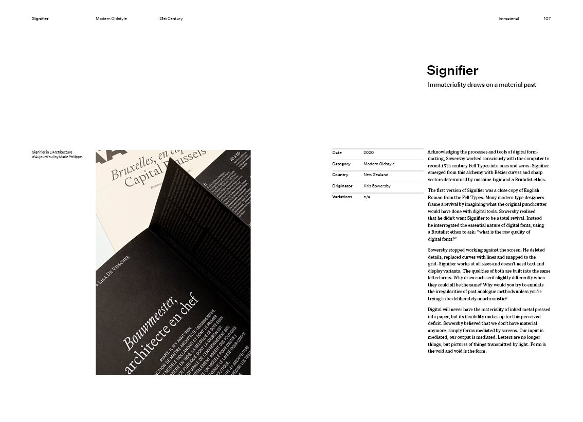
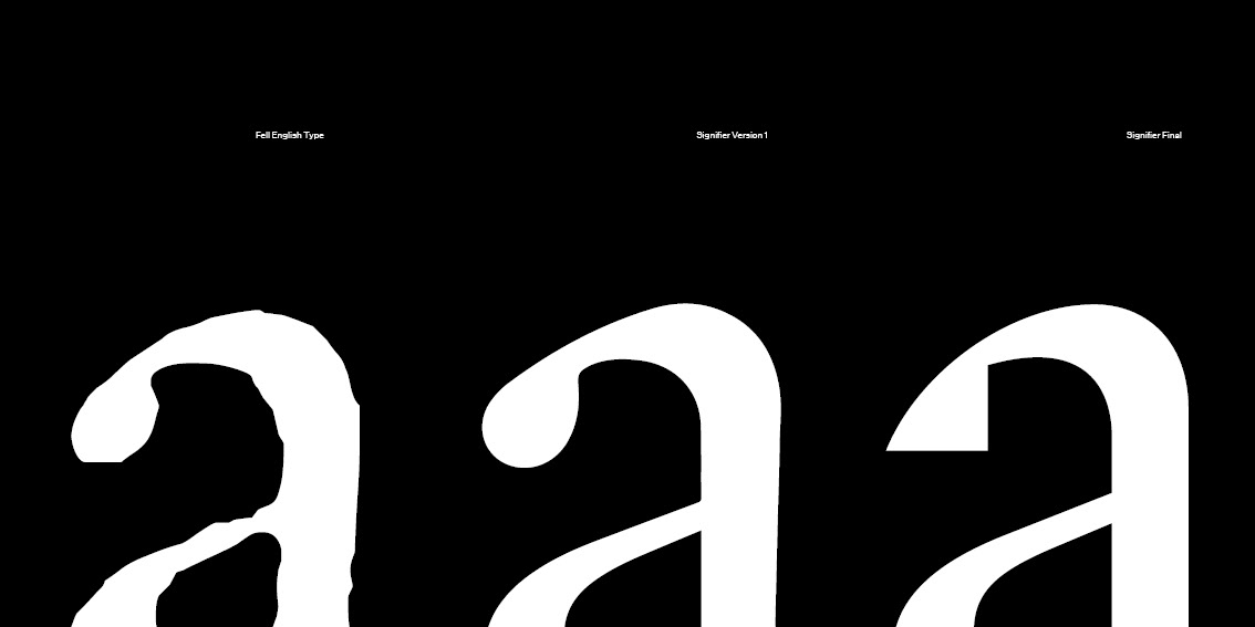
The curation of my book and its design direction were based on Kris Sowersby’s essay on his typeface Signifier- which is also my twentieth typeface. He questioned the real nature of digital fonts and what makes them truly digital. This made him turn to Brutalist thinking, highlighting the quality of the digital material. He describes Signifier as having a “digital immateriality [that] draws on a deeply material past” and it’s this contrast of immaterial and materiality that I wanted to highlight in my book.
Each typeface in the book has been chosen or classified for either highlighting their immateriality or materiality. Some may fit into both so when curating I tried to consider the designer's purpose as well as the tools used to make it.
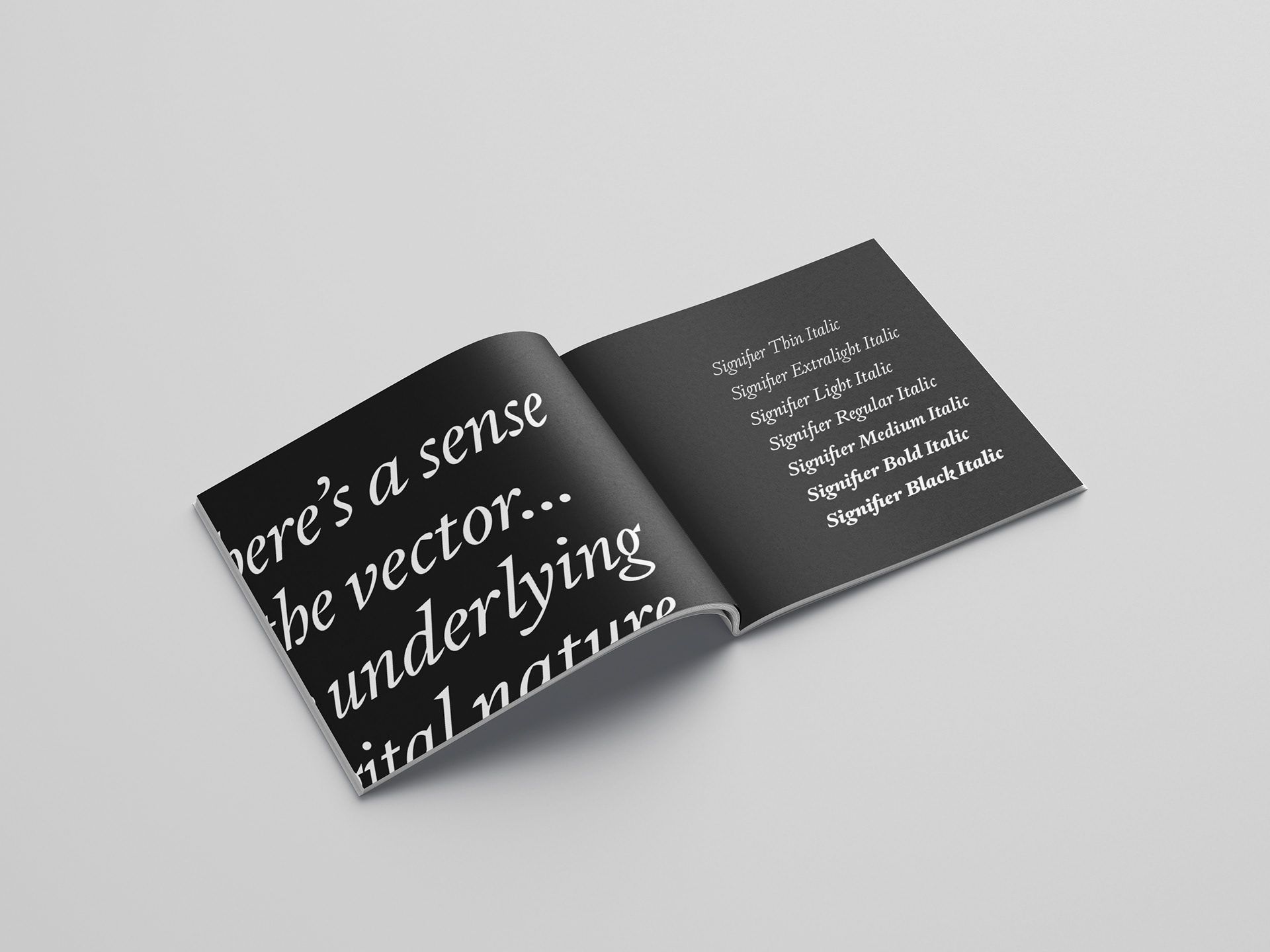
Signifier Specimen
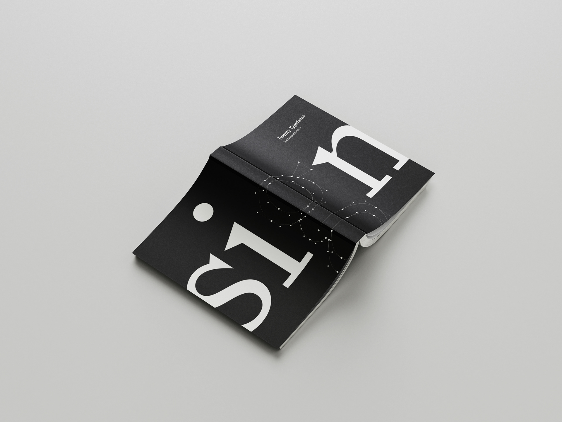
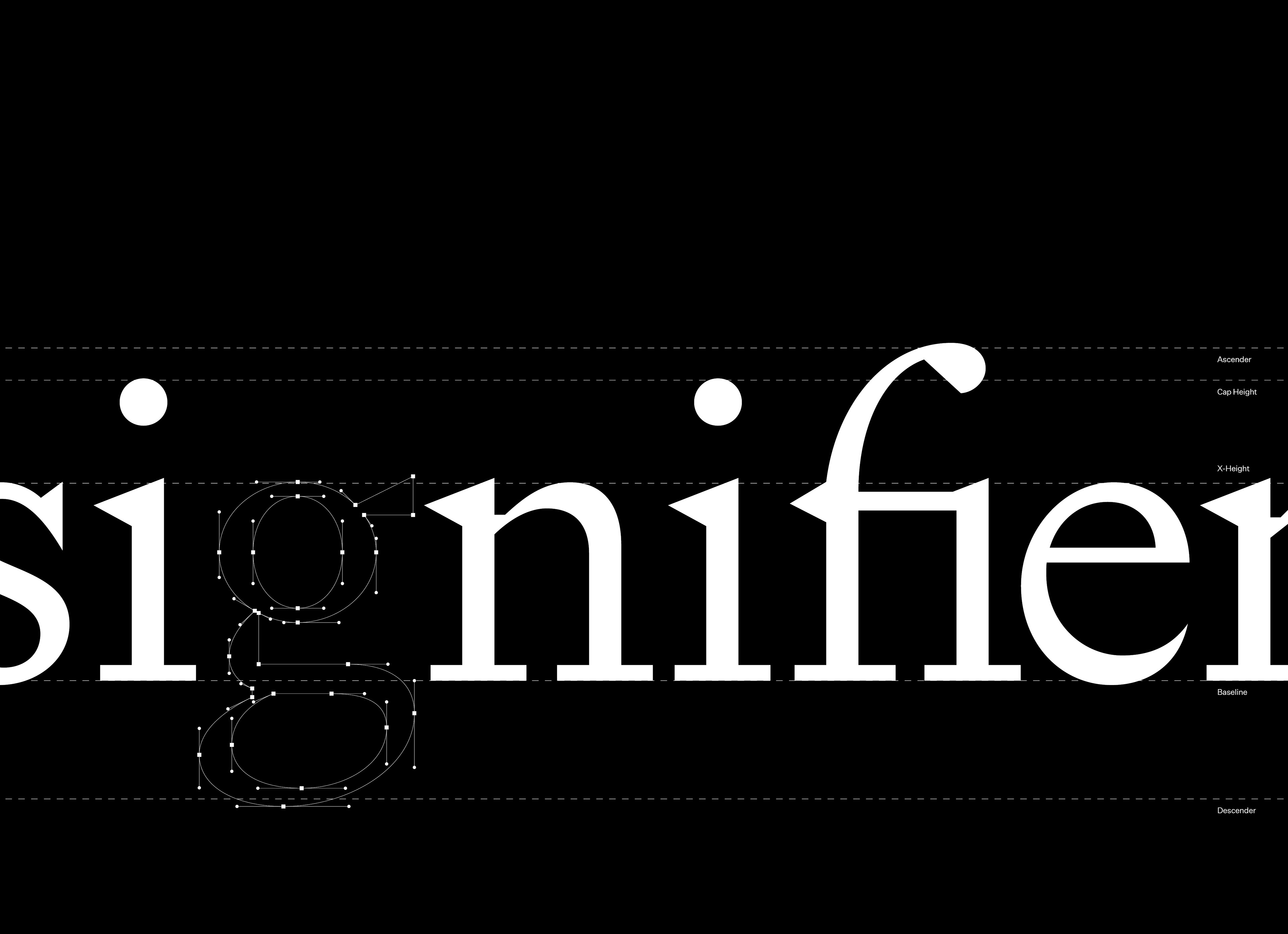
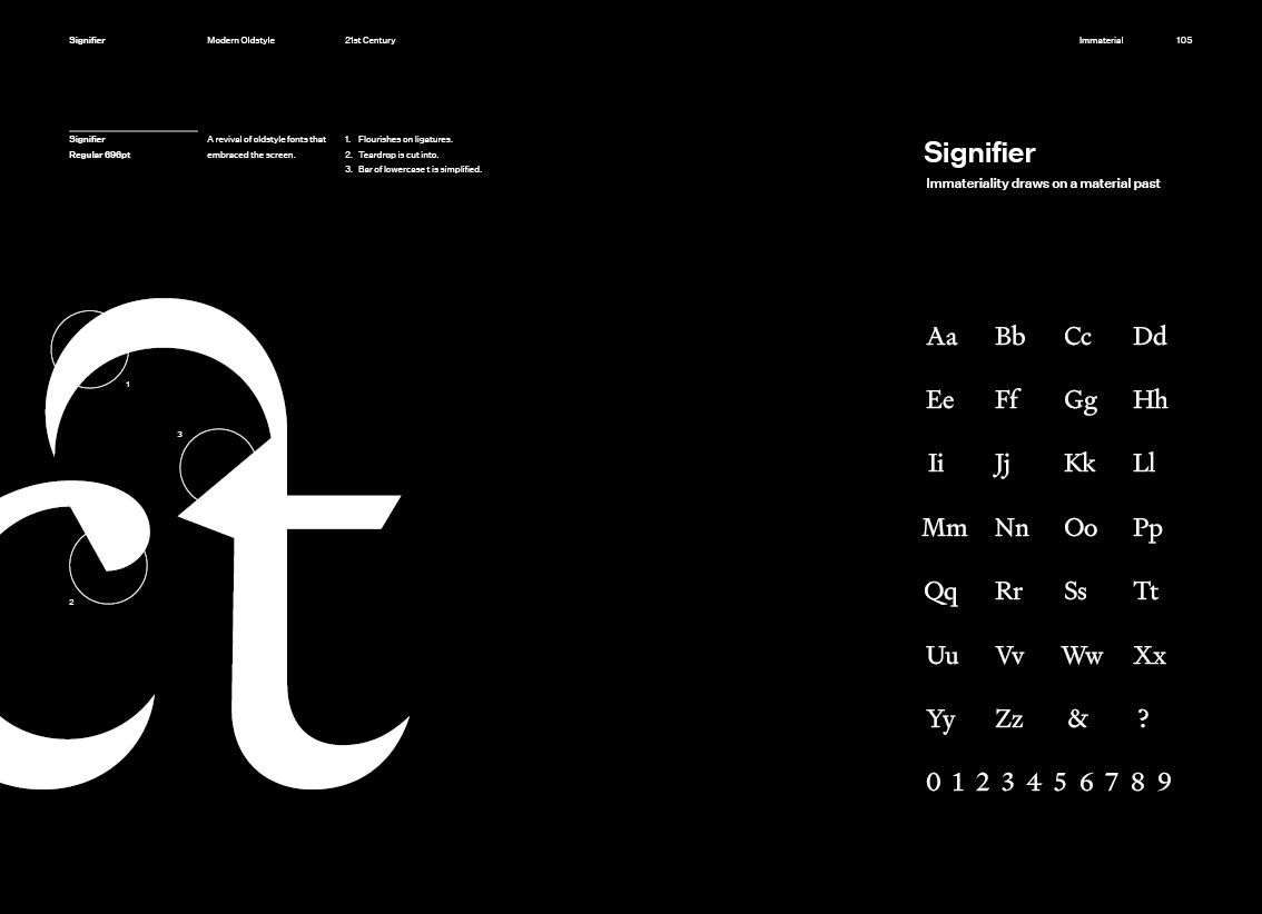
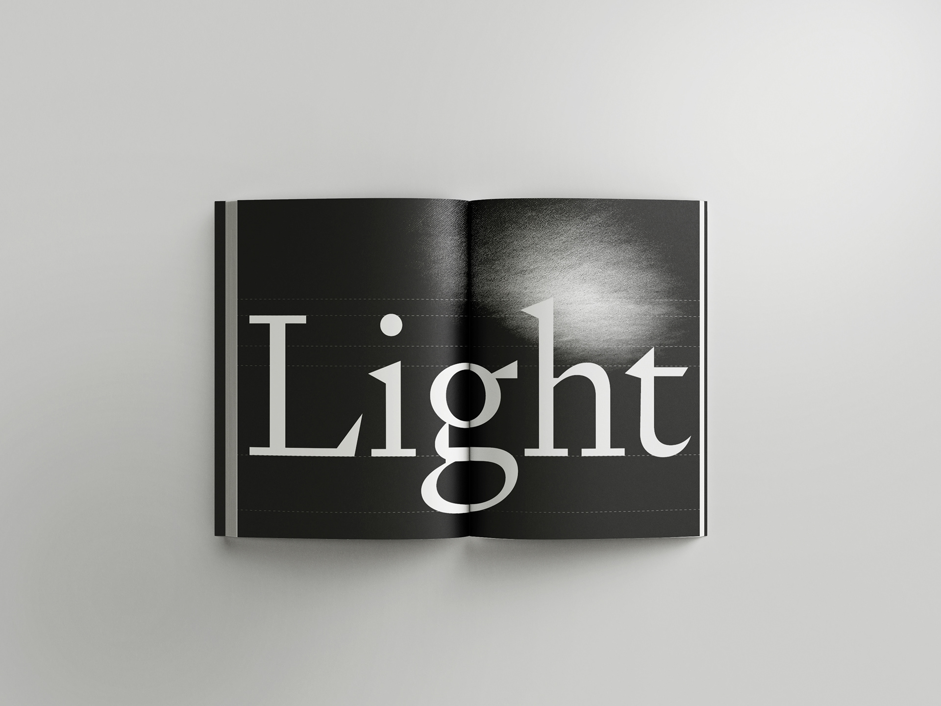
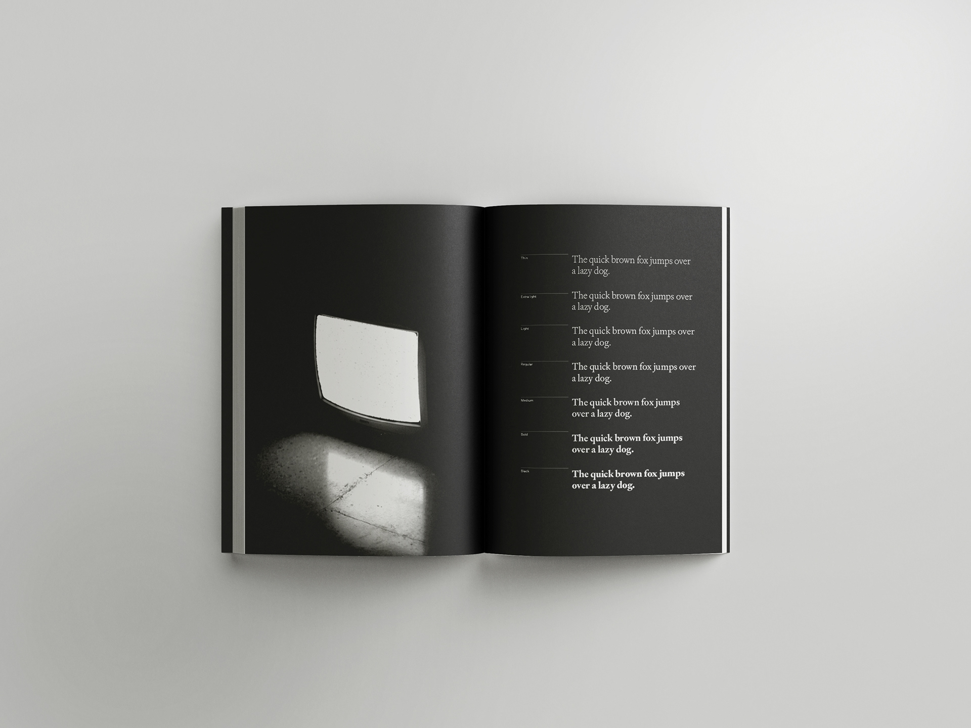
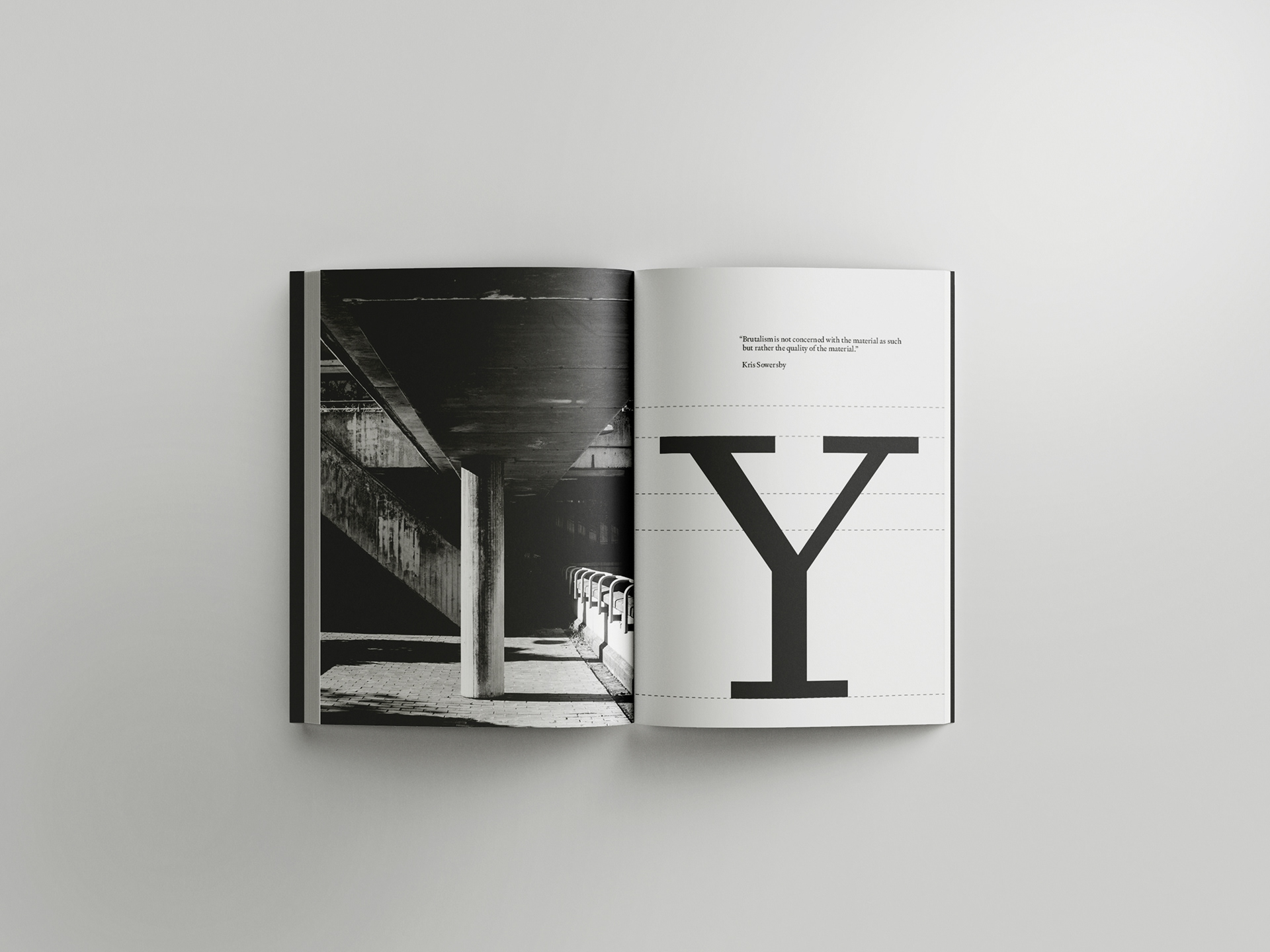
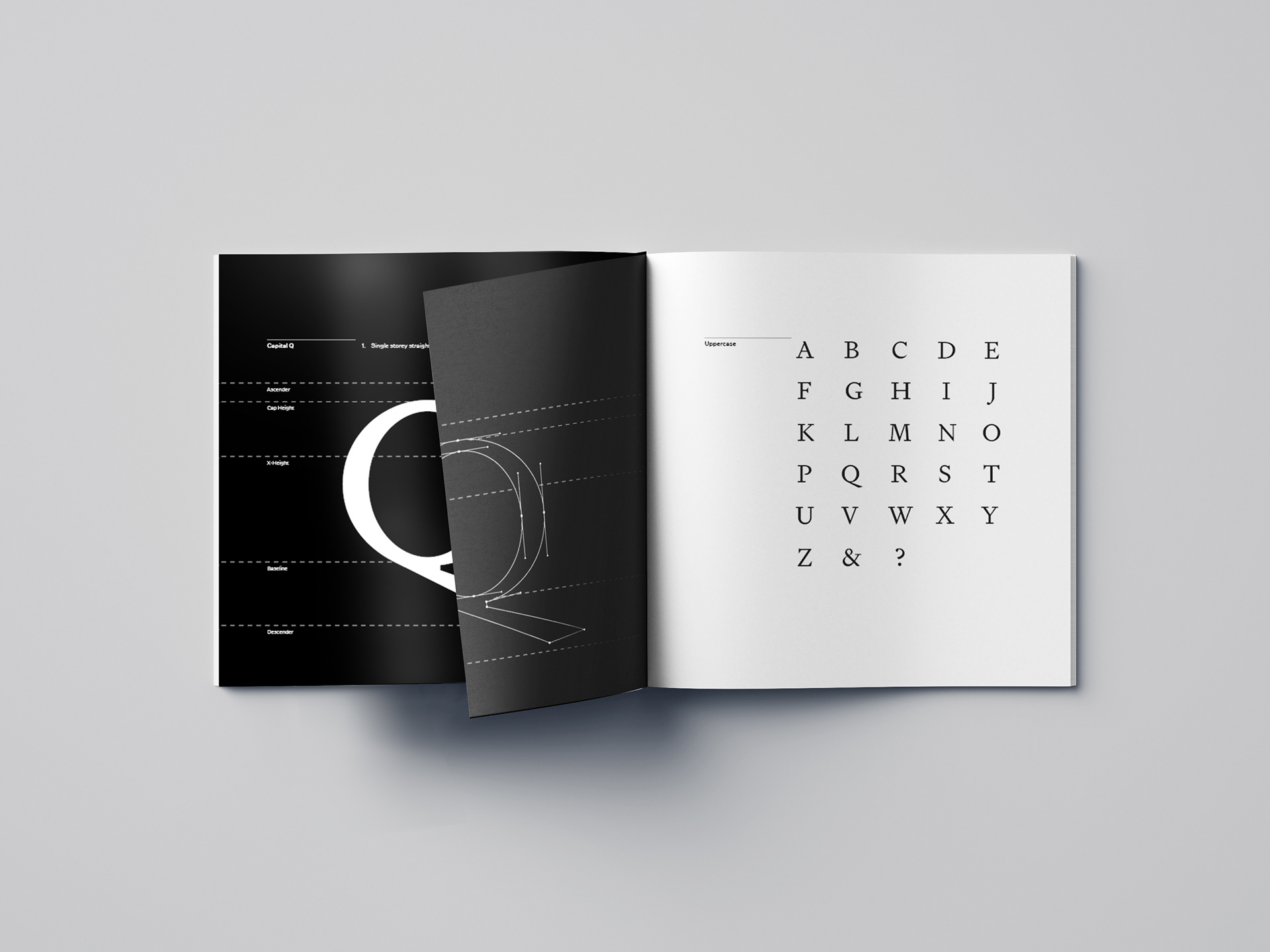
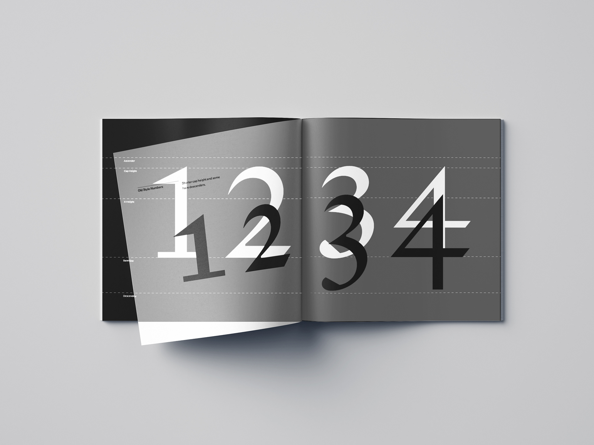
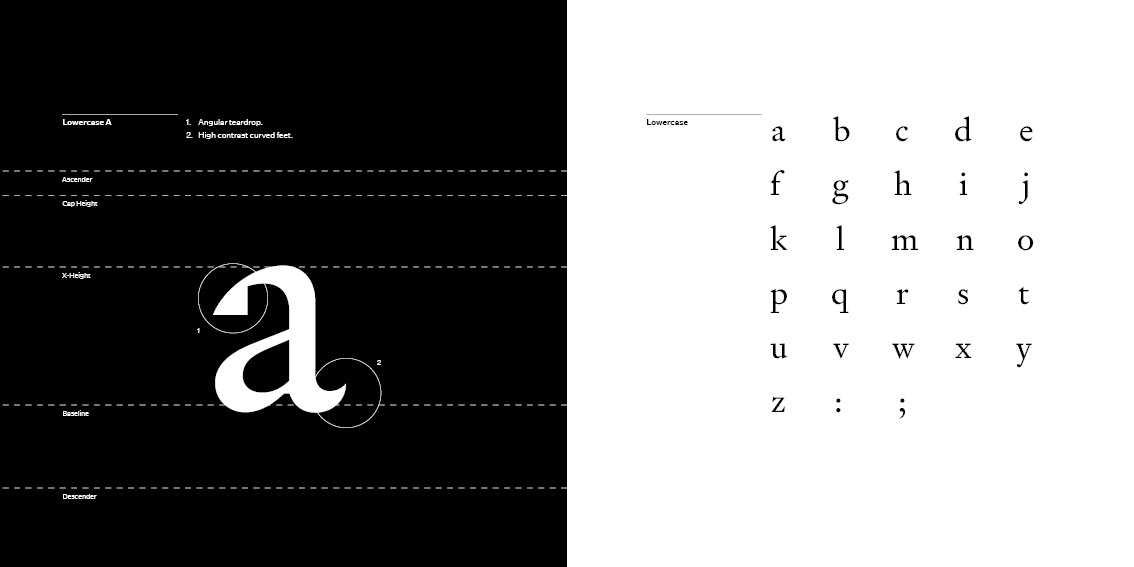
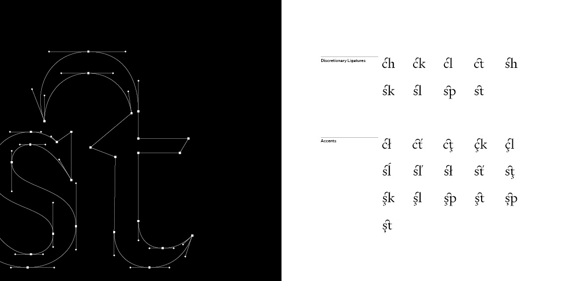
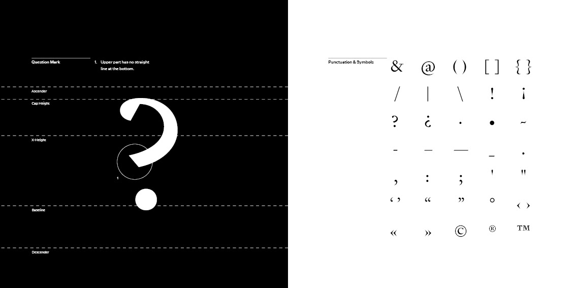
In a sense, the “material” that digital fonts are made out of are bézier curves which is why I chose to put them throughout the specimen. In the last few spreads you can flick the pages between the bézier curves and letterform, showing its construction or anatomy. I also chose to use different paper stock for the cover and the numeral spread. I thought it would be fun to compare default numerals to old style numerals with detail paper. In his essay, Sowersby also talks about how digital forms today are now transmitted by light so I tried to convey that similar feeling by printing black ink on black paper—making the letterforms visible when light is reflected on them.
While it was tempting to create a digital specimen for Signifier I thought it would be nice to present it in a material way, coming full circle back to its material past.


